Orbit.
Project Overview.
Orbit was born out of the need for immigrant workers to access high quality financial services on arrival in the UK, recognising that they frequently struggle to setup a bank account for a number on months, putting their new lives on an immediate back foot.
When they do finally get an account, it rarely lives up to the user experience expectations they have from their home country, where banking is both mobile and social, connecting your whole world from paying friends to ordering food.
The lived experience of this challenge aligns with the principles of the FTFT Group. They’re on a mission to build high quality financial services products that empower people, across all part of society.
Skillsets:
- Branding
- Web Design
- Animation
Proposition Development.
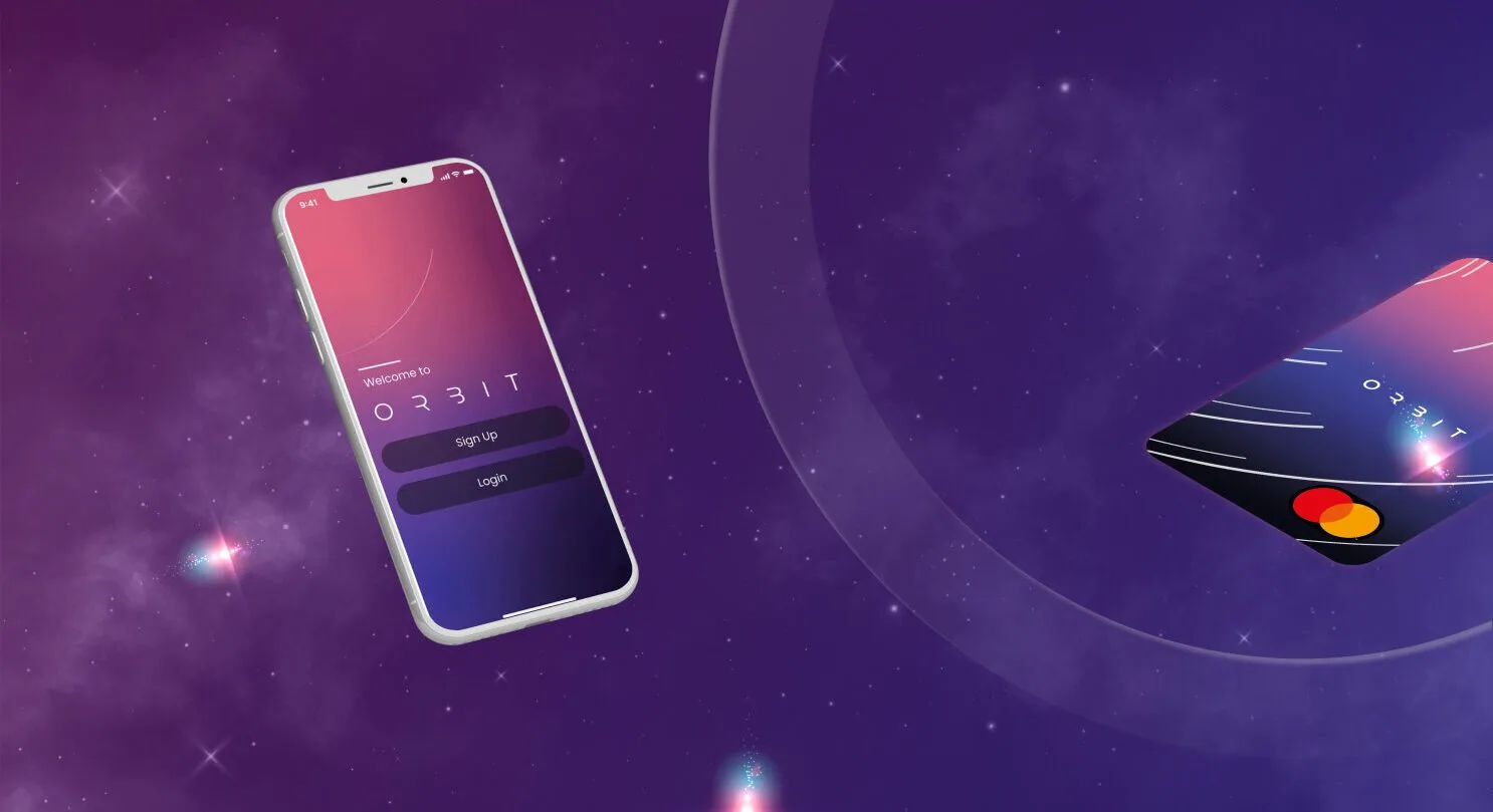
Orbit is a mobile bank, and then some. Designed for the connected world, it is a product that represents the future of digital banking – Easy, speedy and social. Whether you’re new to a country or a long-standing local, Orbit can be set up same-day, allowing you to access a range of services, share with friends and connect to local businesses.
Importantly, we recognise the audience as highly motivated, increasingly educated and looking to build their lives for the better, with seamless financial services playing a crucial role in enabling that.
Developing a Brand Identity.
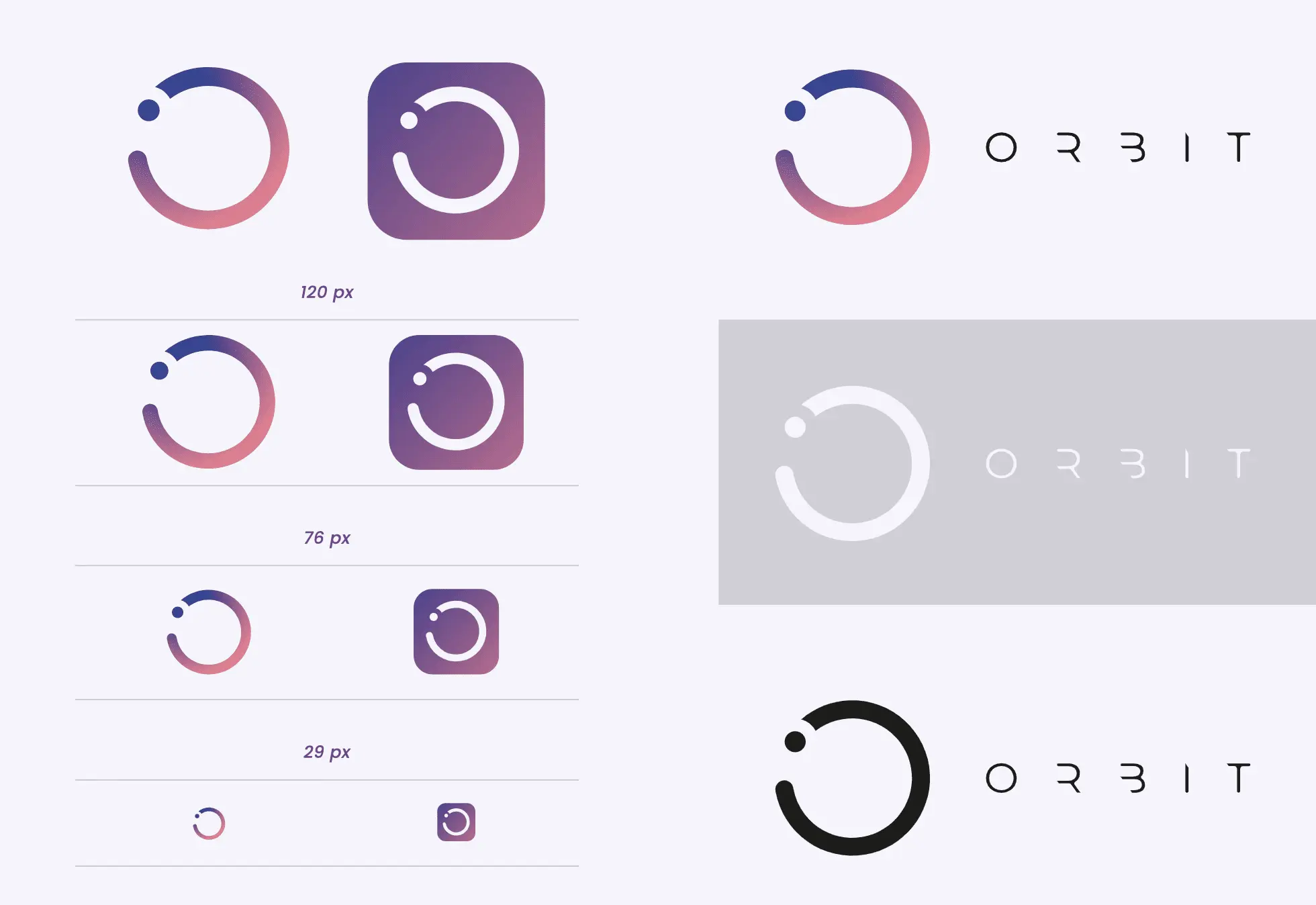
The logo and visual language was designed to allow for imagery and playful patterns to reflect everyday spending habits, building brand equity in the ‘O’ of orbit and giving us a consistent device to centre our message.
The ’O’, like a planet, can connect you to other users, be they friends or local businesses – creating a payment universe that’s easy, speedy and social.
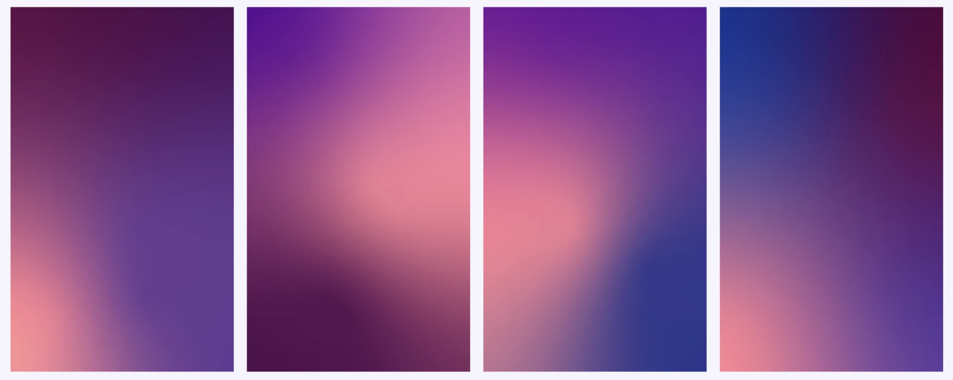
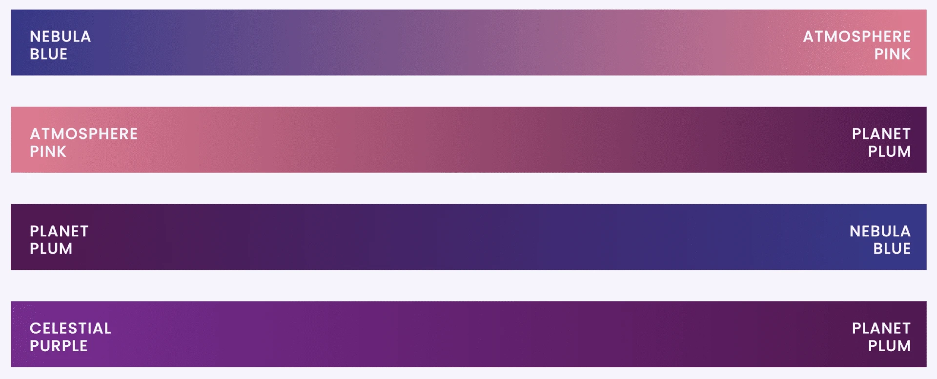
We’d use the colour gradients of the user interface to show customers that they can manage their money, their way, with animation that would feel both cute, and space age, personalised to your spending habits, encouraging users to nurture and care for their Orbit.
Designing Key Band Assets.
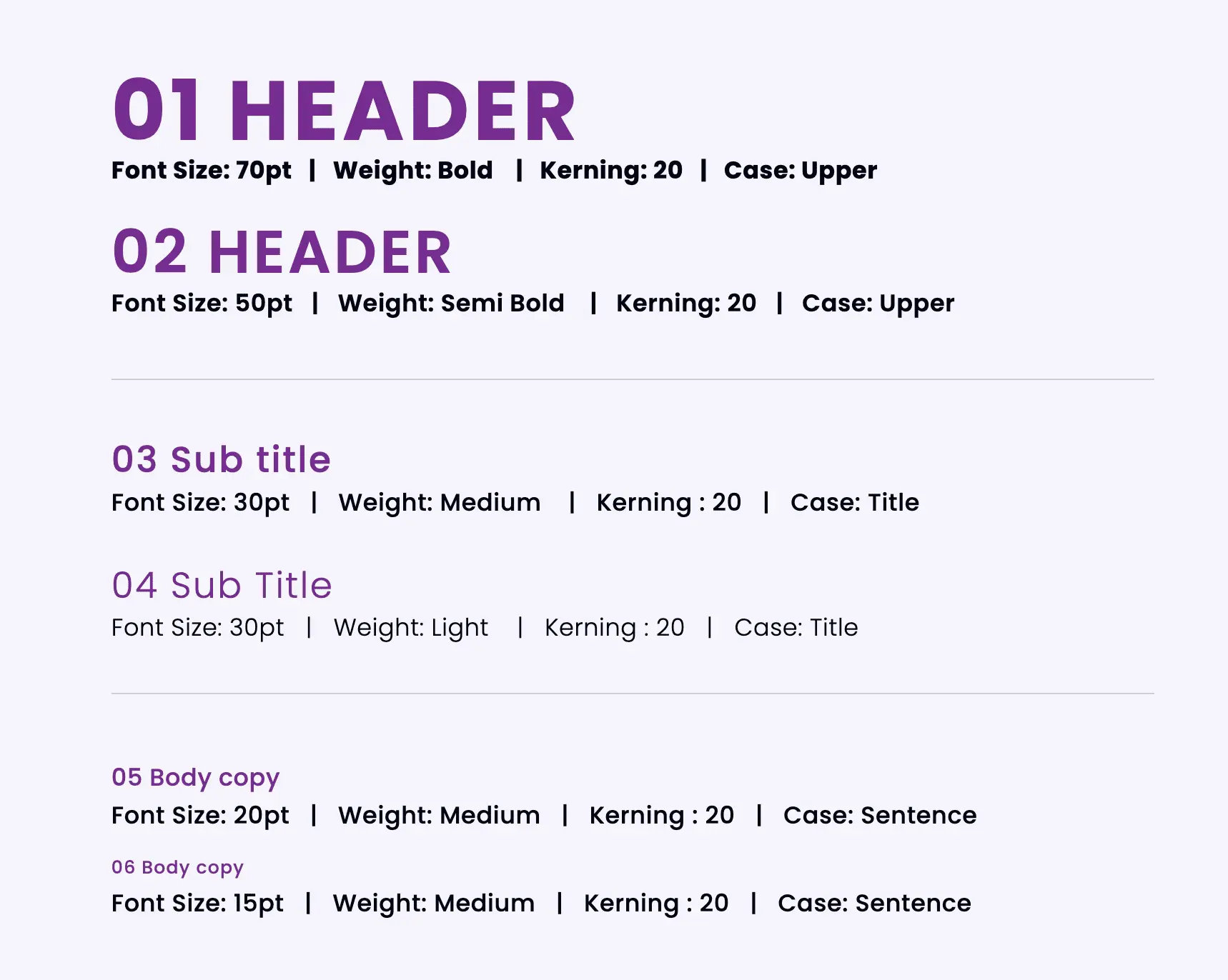
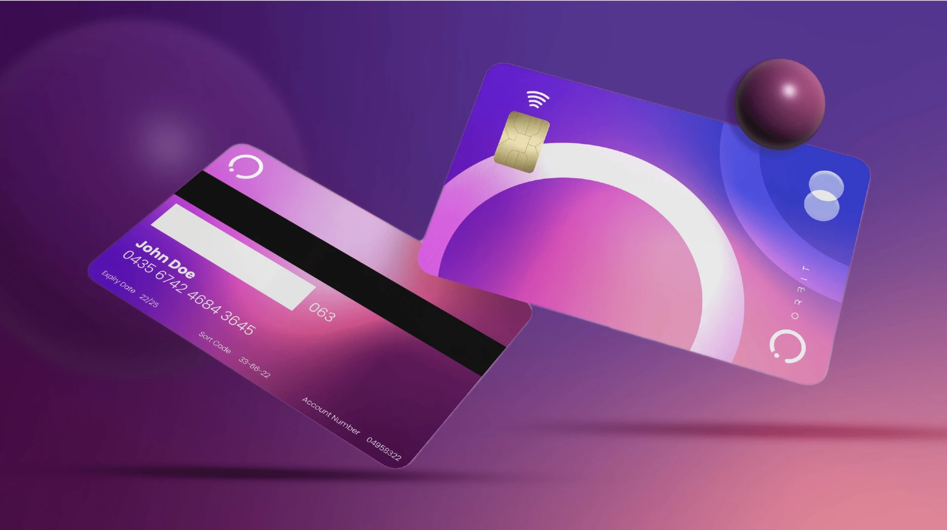
To support a global marketing campaign we rolled out the brand identity across a range of key marketing assets including social, offline and print.
Website Experience.
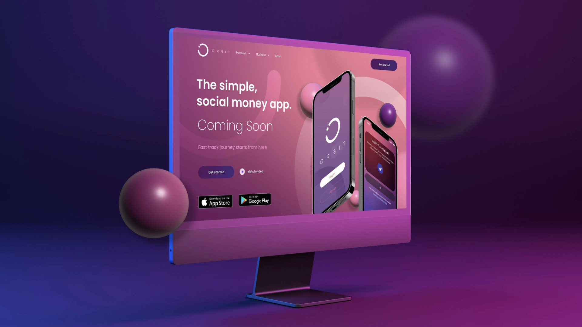
The website was designed to reflect the clear, seamless user experience of the product, building in both eye-catching animation and subtle interactivity.
The card-style layout enabled information to be isolated and easily updated as offers and product features were added to the platform.
Similar Projects.
Birchstone
See how we gave a new FX management business a fresh new appeal.
Winningtemp
See the new identify we created for one of Sweden’s most successful tech companies.
Chain IQ
See how we transformed the identify of a multi-million dollar logistics business.


